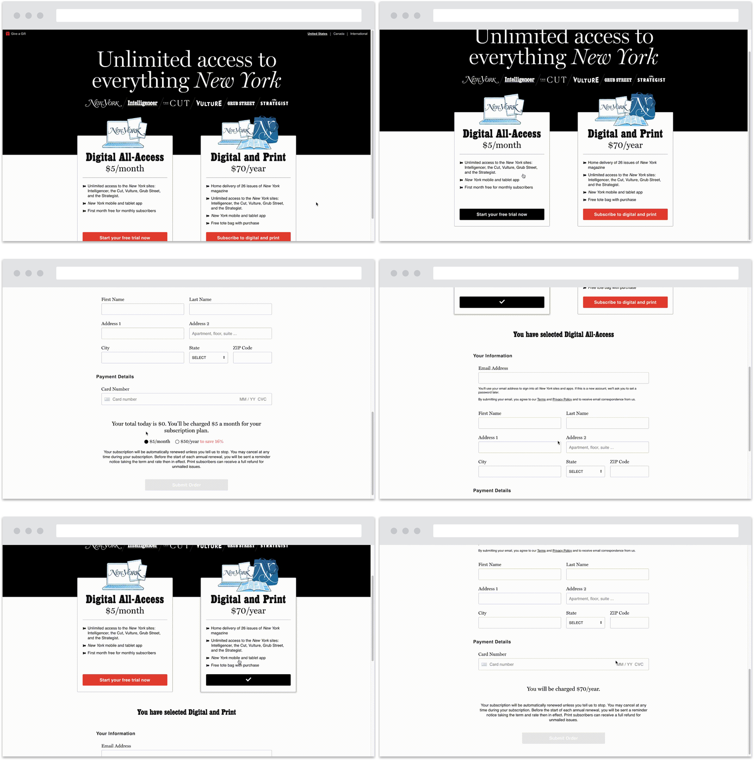
I led the design of our paywall implementation and subscription model. I was responsible for mapping out user task flows, designing the UI and UX, and ensuring visual consistency across its multiple platforms. I worked closely with product, technology, and consumer marketing to understand technical considerations, define our MVP, and roadmap future enhancements. We have continued to release those enhancements and optimize the product over the past year. Since our November 2018 launch we’ve seen an almost 90% retention rate and are on target to hit our year end subscriber goal.
The Team
I was the Product Designer for the project, part of a core team that included a Product Manager and several engineers. We held daily standups and met weekly for sprint planning and grooming sessions. I frequently collaborated with the Head of Consumer Marketing Revenue and his team, as well as our Chief Technology Officer. The company brought in a freelance Marketing Designer to handle the visuals, and we worked together to define a styleguide and maintain consistency across the landing page, email campaigns, and social marketing.
Context & Goals
New York Media has been investing heavily in its online offerings over the past several years. As a leader in digital storytelling, the company felt it was time to put a value on the high quality journalism being produced. This new digital subscription would join an already existing print plan and iTunes app. The biggest challenge was merging these into a single, streamlined subscription product within a very short timeframe - about 3 months. The scope of the MVP included: implementing site login, authentication, and account management; integrating an additional payment processor; updating the subscription landing page UI; and improving the visual design of our transactional emails. The only aspect that lay outside of the core team was the onsite dynamic meter, or choreographer, which the Chief Creative Officer designed with another Product Manager.
The Research
I focused on two main areas of research before I began designing - competitive analysis and 3rd party platform integrations.
Looking at competitor’s digital subscription products helped me gain insight into UI trends for our landing and account pages. I was primarily interested in the translation from desktop to mobile, the order and steps involved in the purchasing flow, the account creation process, and account settings capabilities.
The subscription product relies on 3rd party vendors for fulfillment, payment processing, login authentication, and data security. It was important for me to understand the UX implications they presented so I could design within those limitations. After discussions with the technology and engineering teams, I identified a couple areas in particular that could be problematic. The most significant was the out of the box log in and sign up experience. There is a single modal for both logging into the site and creating a new account. Even though it is separated into tabs, you can’t deep link to one instead of the other for each use case. It also lacked anything beyond very basic customization options so the visuals would feel out of sync with the rest of the product.
All this research helped me come up with a list of recommendations that would serve as a starting point for my designs.
Ideal scenario to avoid confusion around site access, bring the log in / sign up experience in house for more control over visuals and tech.
A single page purchasing experience that integrates account setup into the flow.
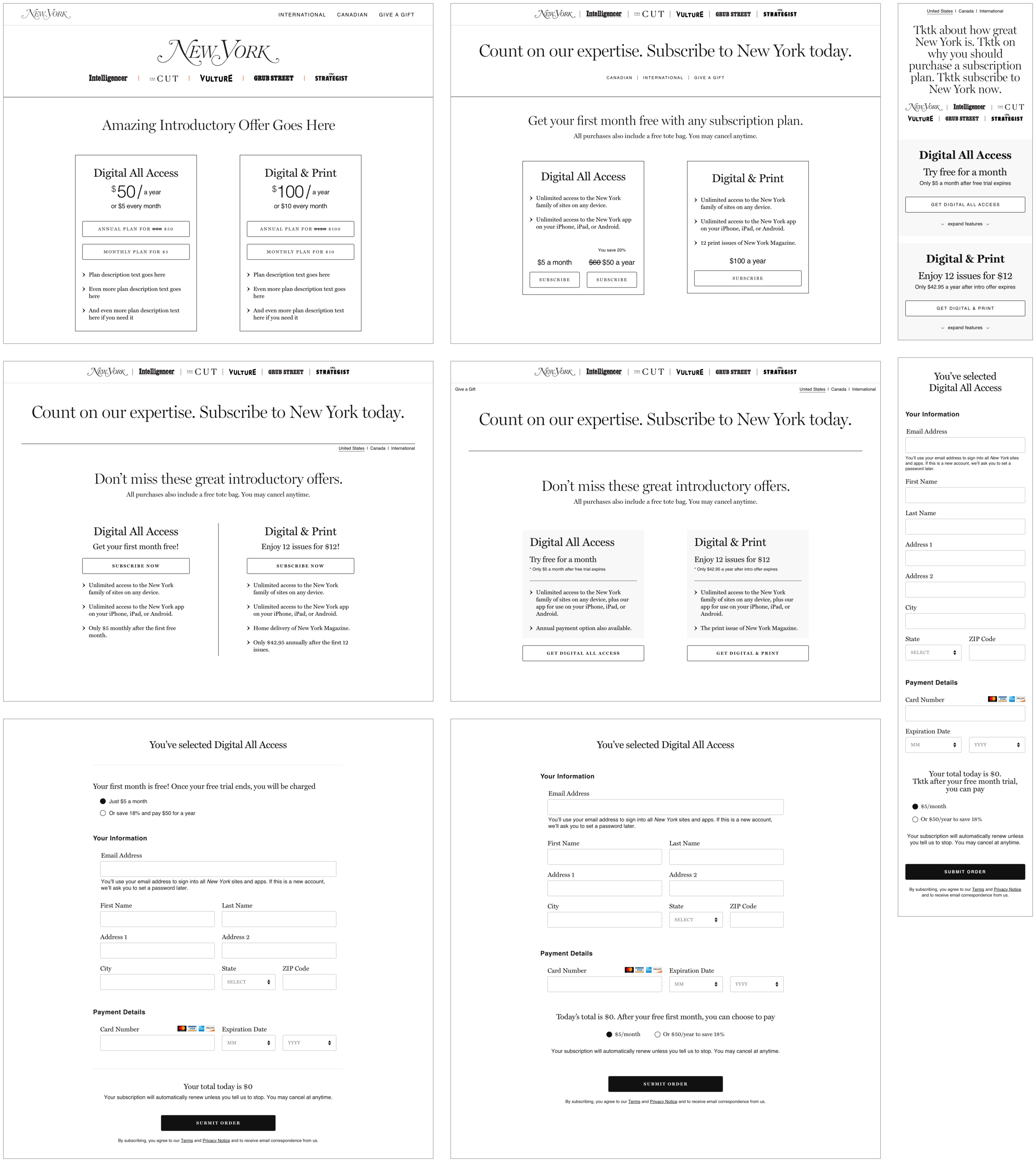
Collapse additional plan details on smaller screens (mobile) to decrease effort to complete purchase.
Because users are accustomed to being able to make changes, include ability to edit information - username, password, payment info, etc - on account page.
Unfortunately the resources and time needed to build our own log in and sign up experience were just not there, so I worked with the Product Manager to come up with a short term approach for launch. This included clear and straightforward instructions on the modal and messaging to push users to create an account immediately after purchase.
Design & Testing
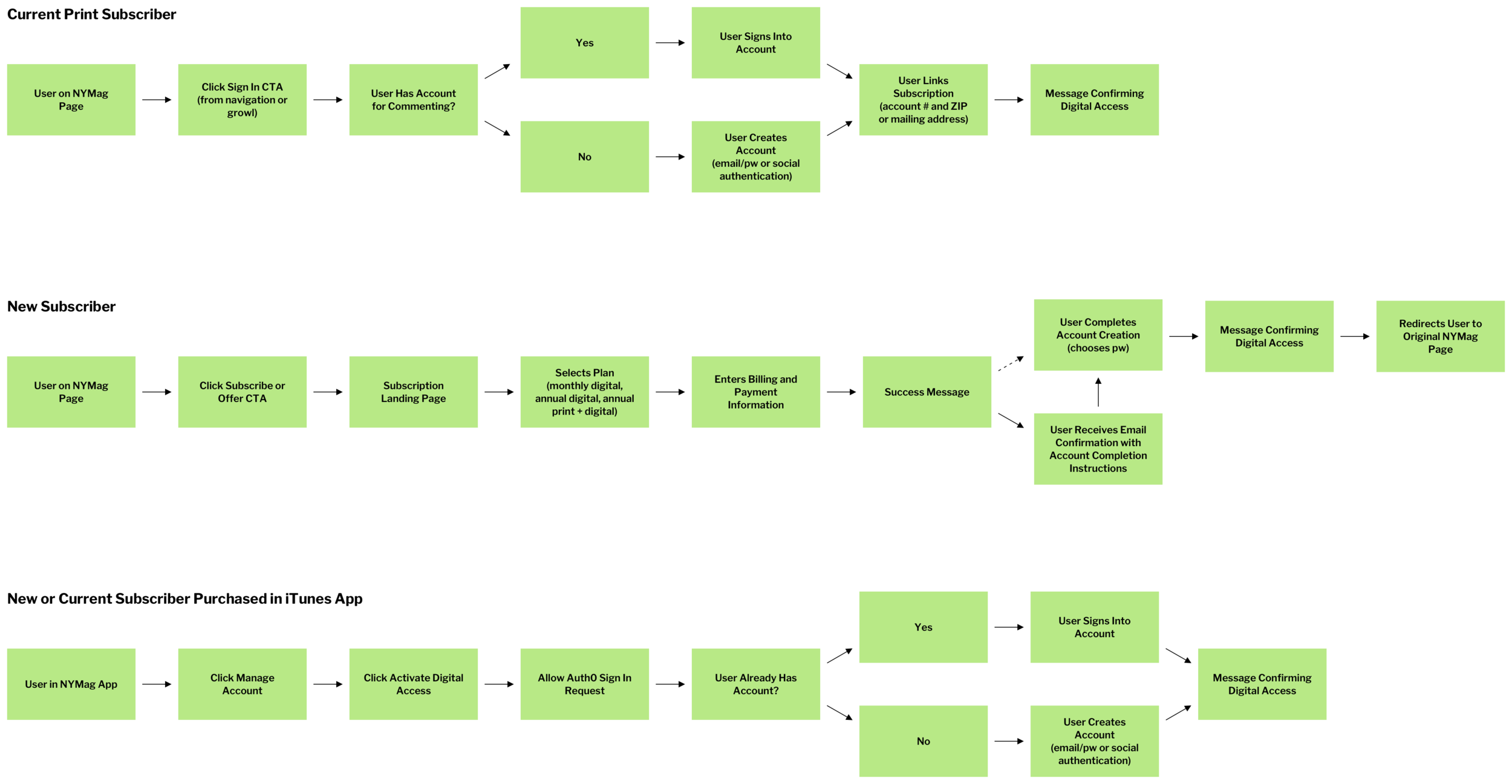
Before I began wireframing, I wanted to map out task flows for new and current subscribers. Since we were combining existing platforms with new ones, our users had multiple entry points into our digital subscription product and varying steps to take before they could access our digital content. Mapping them out helped me wrap my head around the complete experience.
I then started sketching out the new subscription landing page. My focus wasn’t on overhauling the layout but instead finding areas that could benefit from optimization for increased click through rates and conversion. As I mentioned above, account setup integration and collapsable details on mobile were some of the areas where I saw opportunity.
Through discussions with other design teams and feedback from stakeholders, I decided to rethink the single page approach. My goal was to avoid a tedious multi-step process, but I also wanted to make sure every stage of the flow was straightforward. My solution was to hide the form until a plan is selected and then move the user down the page automatically. Each step is singled out but there are fewer opportunities to leave without purchasing.
At the same time I was working on the structure of the account management experience. For launch the page would display minimal information, but it needed to scale easily since it would eventually include additional preferences and memberships. I explored whether to include a menu (something my Product Manager was pushing for) even though it wasn’t really necessary yet.
Once the flows and architecture were in place, I worked with the Marketing Designer to add visuals and give the pages some character. It was important that things like color, typography, and navigation were consistent across pages to create a wholistic user experience. In addition, the consumer marketing team provided guidance for tone of voice on the landing page and we worked together to determine the best way to display the right message.
The Outcome
Due to the short timeframe and unforeseen technical issues, certain functionalities that I had incorporated into my designs ended up being impossible to build for launch. We were unable to integrate the account creation process into the purchase flow, provide account editing abilities, or build in additional mobile-specific functionality. Despite my frustrations, I understood that the company had committed to a launch date and put my energy into making sure improvements were released as soon as possible.
New Subscriber Purchase Flow


Existing Subscriber Flow


Post Launch Improvements
Immediately after launching, data confirmed the concerns about potential for confusion over the log in and sign up experience. We were seeing a trend of duplicate accounts and it was the primary issue addressed in customer support tickets. The company also noticed lower than expected mobile conversion rates. We updated the subscription product with many of the functionalities I had included in my MVP designs, as well as a simplified mobile experience with Apple Pay capabilities.
Updated Purchase Flow
Mobile Optimizations
Updated Account Management
I am very pleased that all of these improvements have significantly lowered the number of customer support tickets received, bumped up our conversion rates, and simplified the subscription process so that our users can easily access all the digital content we create for them! My team and I continue to refine and expand the product, and next up we will be building our own log in / sign up experience and running A/B tests on the landing page visuals and language to inform how we can further optimize it.


