Vox Media’s advertising network, Concert, launched in 2016 with a beautiful marketing site to attract new advertisers and premium publishers. But by 2023, it had become stale and lacked the most up to date information on the software. I led the end-to-end design and build (using a website builder) of a new marketing website, working closely with the Design Manager and Head of Product.
Context & Goals
The goal of the project was to create a site that better reflected the core offerings of the Concert Marketplace, while feeling as premium as its audience. Part of the reason it hadn’t been updated in years was because of the difficulty in doing so - the site had been hand coded by a designer no longer on the team. So it was important that this new site could be easily maintained and updated as new Concert features were released. It was also a great opportunity to refresh the branding for the whole Concert ecosystem.
The Research
I began by exploring websites that could provide UI inspiration. These included tech companies and other media companies that had ad management software, such as Buffer, Snapchat, Teads, and Stripe. I noted similarities across the sites and came up with a set of recommendations for organizing the site’s content. Through reviews and discussions with the Design Manager and Head of Product, I nailed down a structure for the site and felt comfortable beginning the wireframes.
At the same time, I was looking into which website builder would be best for our use case. The initial plan was to use Webflow, but after learning more about the software it was clear that someone with technical knowledge would be necessary for the upkeep - something we didn’t want to rely on. I pushed to use Framer because of it’s user-friendly interface (similar to Figma) and it’s extensive out of the box templates.
Product Design
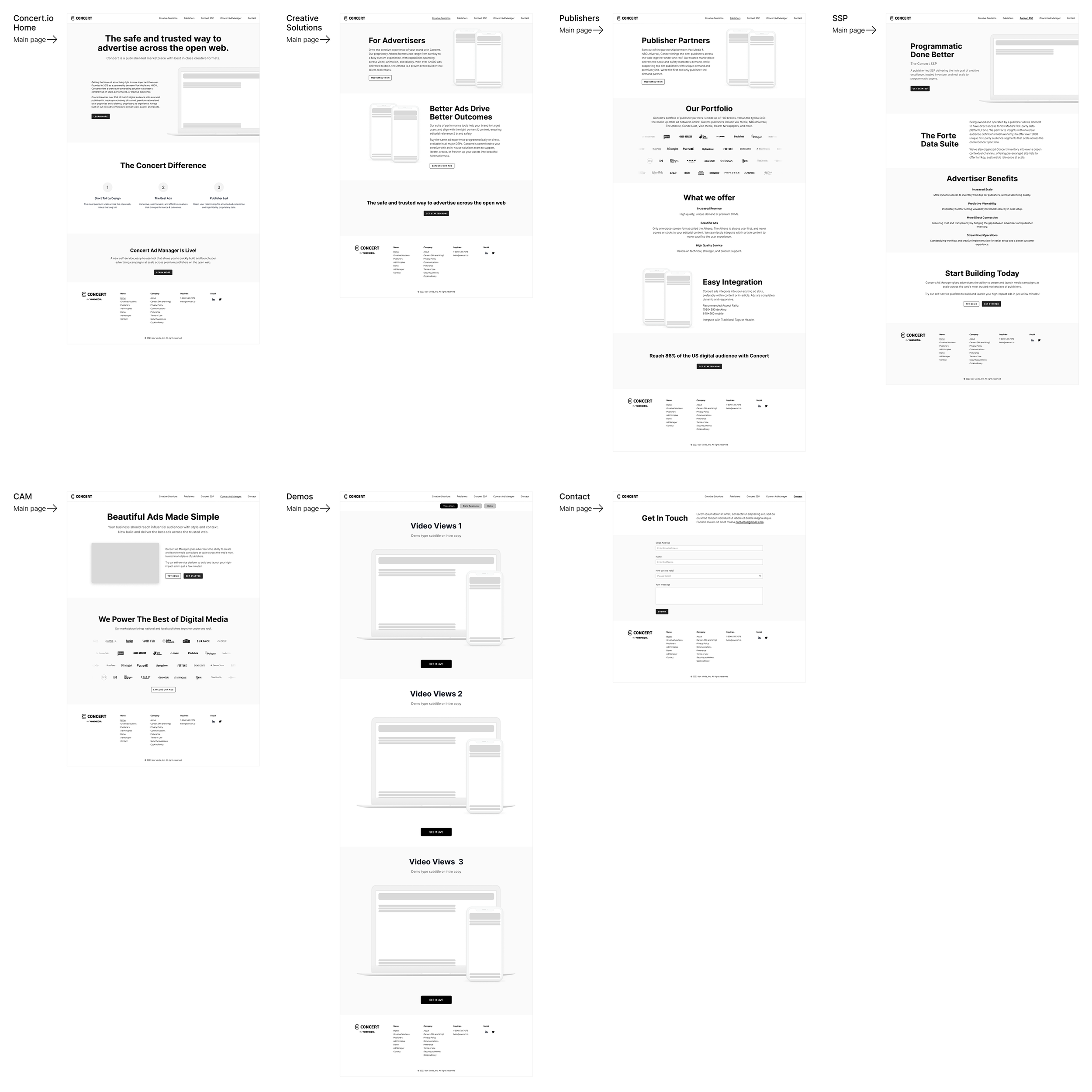
The new site would have a homepage, a section page for each core offering, a selection of demo ads, and a place to get in touch. Using bands of content allowed me to repeat the structure throughout all the pages, while still giving each its own look with components that best fit the particular content on that page. And it meant the site would scale easily, since new content could be added (or removed) without disrupting the information around it. Our main audience would be viewing the site on a desktop computer, so I focused on wireframing that layout and then designed the mobile versions directly in Framer.
Visual Design
The visual overhaul was quite extensive - I needed to choose fonts, a color palette, icons, imagery - and it was definitely my biggest challenge as it had been a while since I’d done branding work. I did a lot of sketching and met regularly with the Design Manager to review my work. I found inspiration in the name, Concert, and designed a repeatable graphic element that invoked sheet music. I used similar design elements as our advertising tools so there was a through line connecting everything. I collaborated closely with the Head of Product to turn abstract concepts into illustrations. Since I lacked the time to execute some of our more complex ideas, I turned to Midjourney to achieve what I envisioned in my imagination. Finally, I took advantage of Framer’s functionality and incorporated interactive elements into the site - icons appear to be drawn in, scrolling images and slideshows.
The Outcome
We launched the new Concert marketing site in early 2024 and our sales teams couldn’t be happier. They now have a beautiful site with all of Concert’s core offerings to share with potential clients. With refreshed branding and a clean UI, Concert Marketplace finally looks like the modern, successful product it is. And with Framer’s simple interface, the site can scale as needed alongside Concert’s growing functionality.


